
Skyscraper banner
A narrow vertical placement for sidebars. The long reading path supports stacked identity, product and action information.
- Design question
- What must remain readable at this size, and what can be removed?

Study how one course identity adapts across banner proportions, messages and learning contexts without relying on exaggerated promises.
Study the formats ↓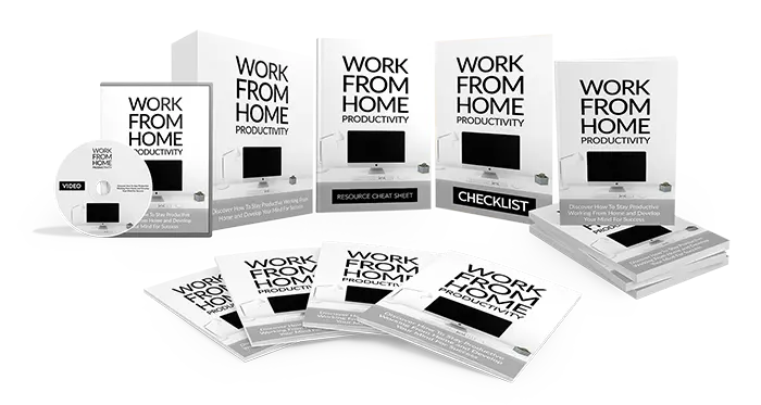
The supplied bundle image arranges a book, checklist, resource sheet, disc and digital display into one visual family. Repetition of the wordmark builds recognition; varied object shapes communicate a collection.
Each GIF remains animated. The orange “Click Here” wording is part of the historical artwork, but the images below are learning references—not active transaction buttons.
A narrow vertical placement for sidebars. The long reading path supports stacked identity, product and action information.

A very small placement where the message must remain recognisable with minimal text.

A balanced format for thumbnails, cards and compact promotional spaces.

A common content-column shape with enough room for identity, benefit and action.

A shallow format that requires one fast visual route from brand to message to action.

A wide header-style placement that distributes brand, product, headline and action across one line.
Show the correct Work From Home course identity.
Name the specific learning benefit and audience.
State access conditions and any partner relationship.
Use a clear next step that performs exactly as labelled.
Select one square, one horizontal and one vertical format. Write a consistent headline, one verifiable benefit and a functional call to action for each. Adapt the composition instead of merely shrinking it.
 VISUAL ARTS